

Tick's
Online booking platform.
Tick's is a booking service working in Italy, offering different types of services. Founded in 2013, Tick’s has sold more than 50.000 tickets for over than 300 music events. To expand the business they decided to sell tickets for different types of events, such as music, exhibit, theater, sport and others. I was asked to redesign the User Experience and the Art Direction of their website.
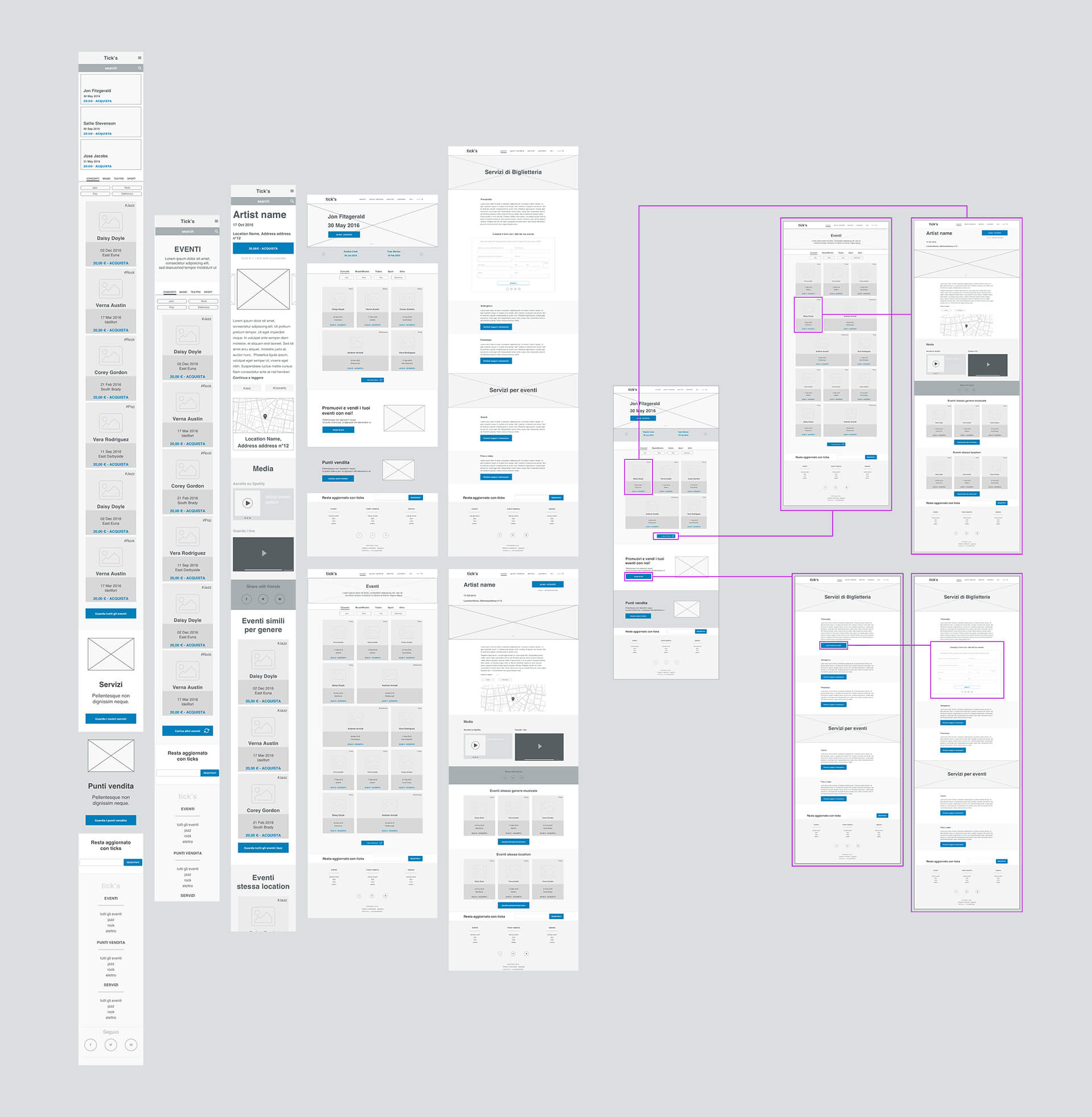
UX & wireframes
I sketched the first idea on paper discussing with the client, understanding their needs and thinking further than the core business (gig's booking). I've designed high fidelity wireframes and site flow to show the new UX to the clients.
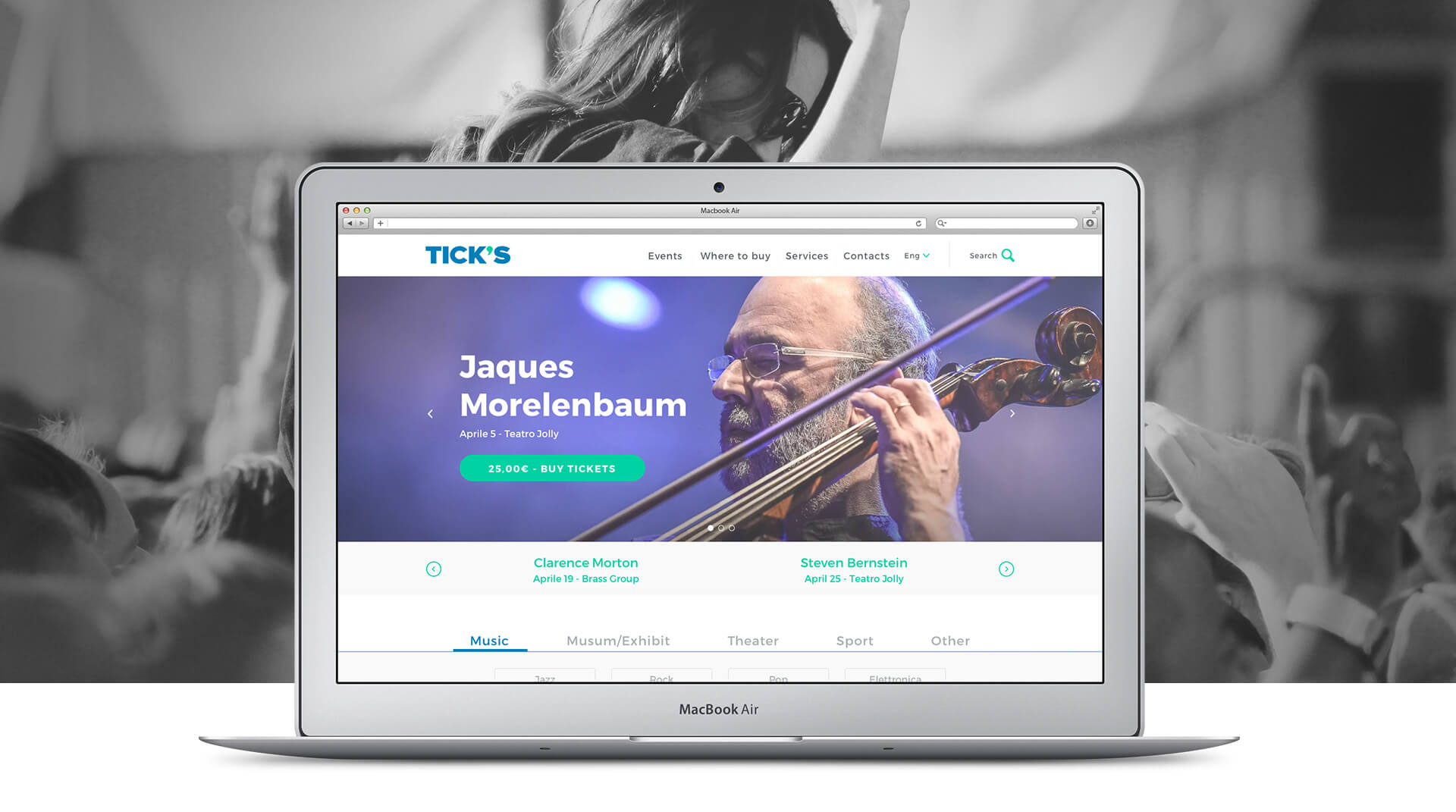
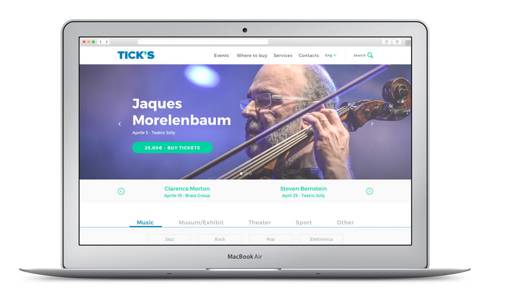
Homepage
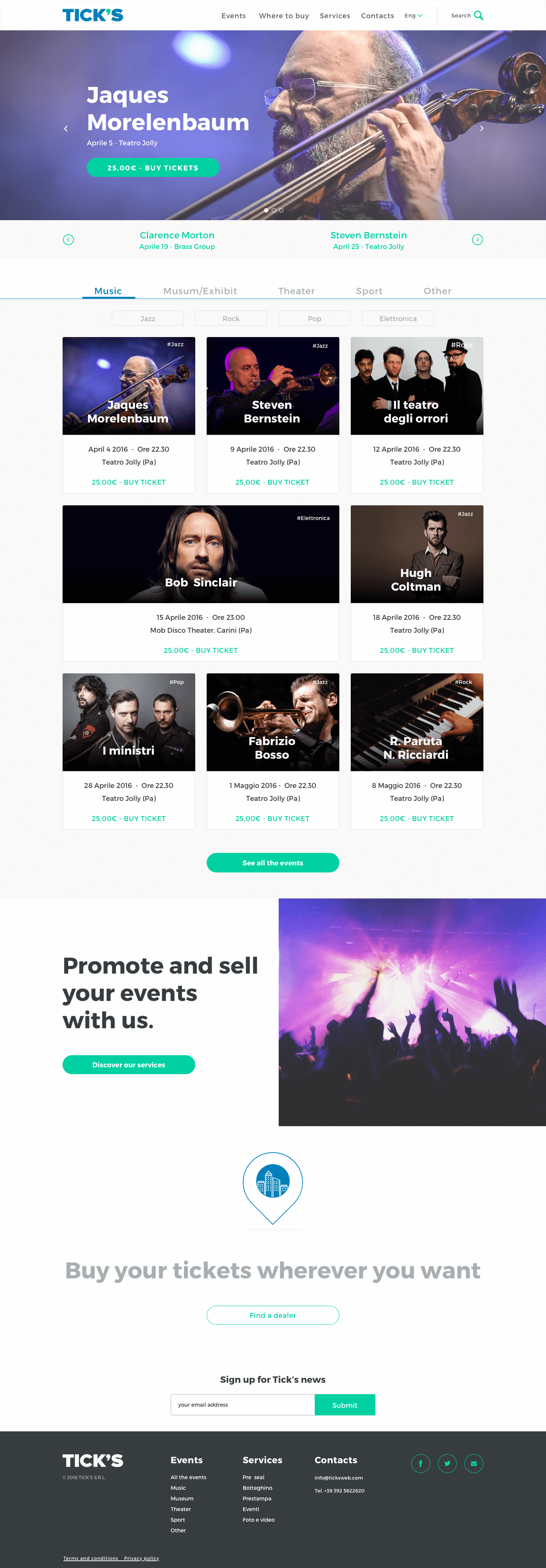
Landing on the website the users can immediately notice what are the next events. Scrolling down a tab allows them to choose the type of event they’re interested in. Without clicking on any of those buttons, the home page shows all the events chronologically.
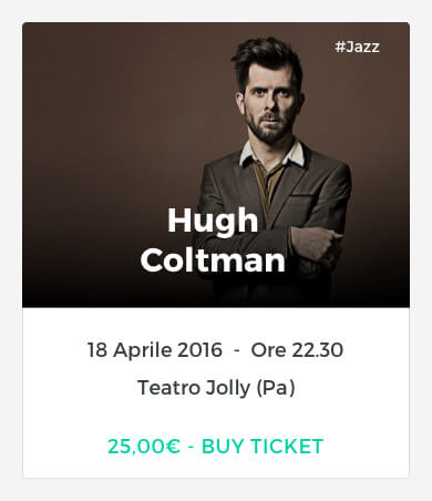
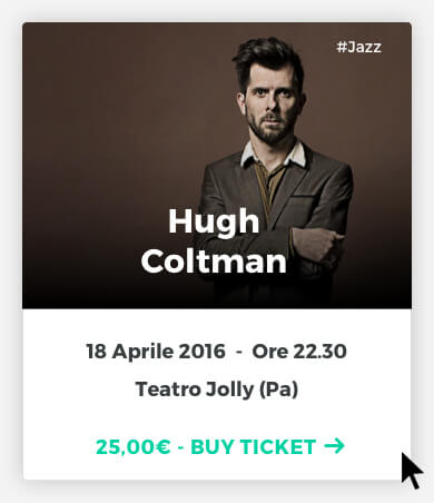
Every event is represented by a card that show all the info a user needs, such as the type of event, the category, the artist, date, location and price. Different entry points brings the promoter to the Services section, where they can fill a form to work with Ticks or have more informations about all the services available.
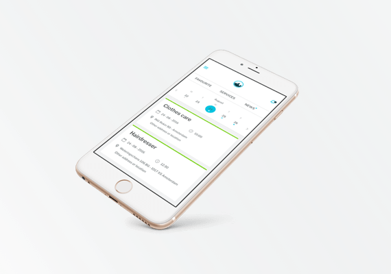
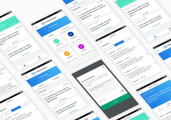
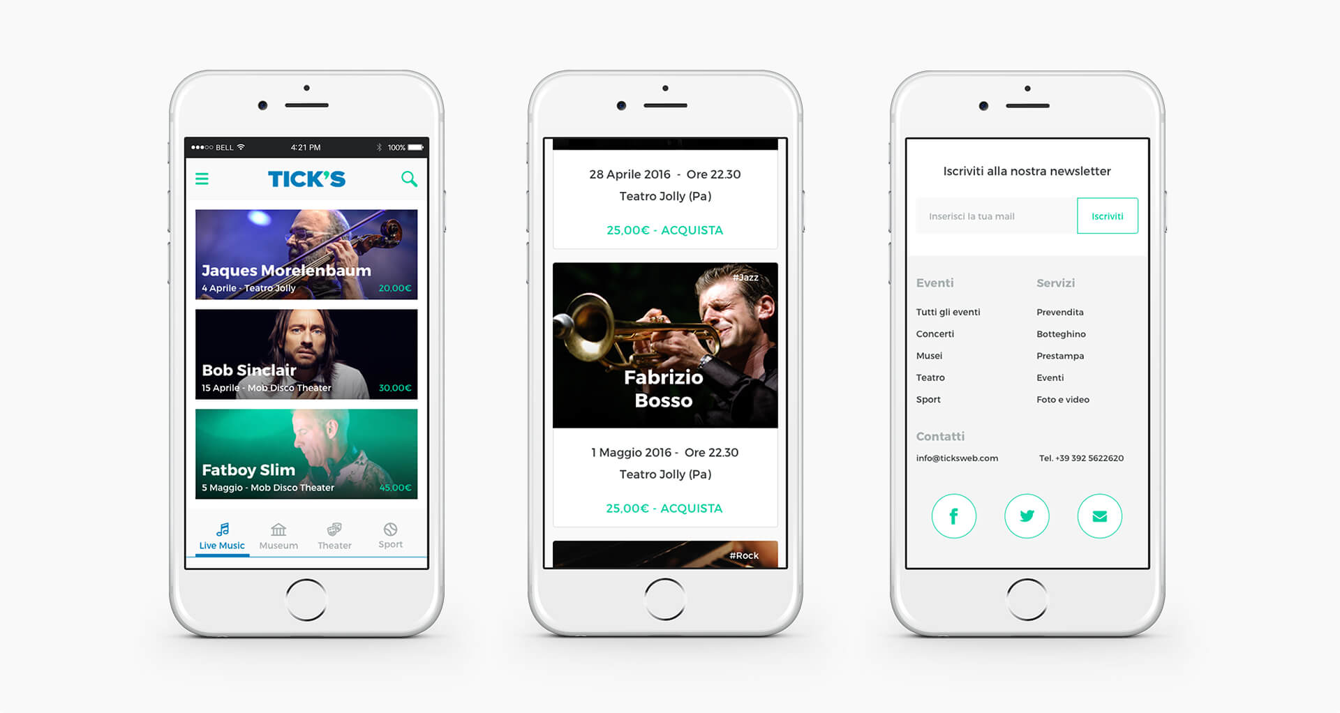
Mobile
I’ve designed the wireframes and the layout on mobile first, adding more content increasing the resolution. For a better experience on devices with a resolution of 480px or less, the carousel became a list of events. The cards are arranged on three, two or one column, depends on the resolution.
Example of event page
The event page shows immediately the summary of event’s info and the cta to buy the tickets. Scrolling down more content are available to engage the users: a short bio of the artist/event, an interactive map with location, a Spotify plugin let the users to listen and follow artist and a YouTube video shows the live performances.
While the page scrolls, the upper part with the summary information remain fixed on top, to let the user booking the tickets without having to scroll. Less friction, more happiness.

Chiara, 26 y.o.
Student of law, passionate about music.
"The first thing I want to know is Who, Where and When.
I want to be able to buy the ticket without scrolling or wasting time.
Then you can show me all the other fancy things!"

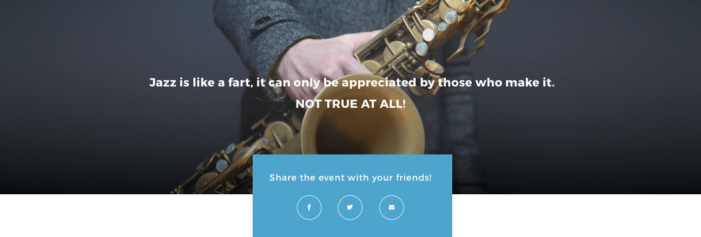
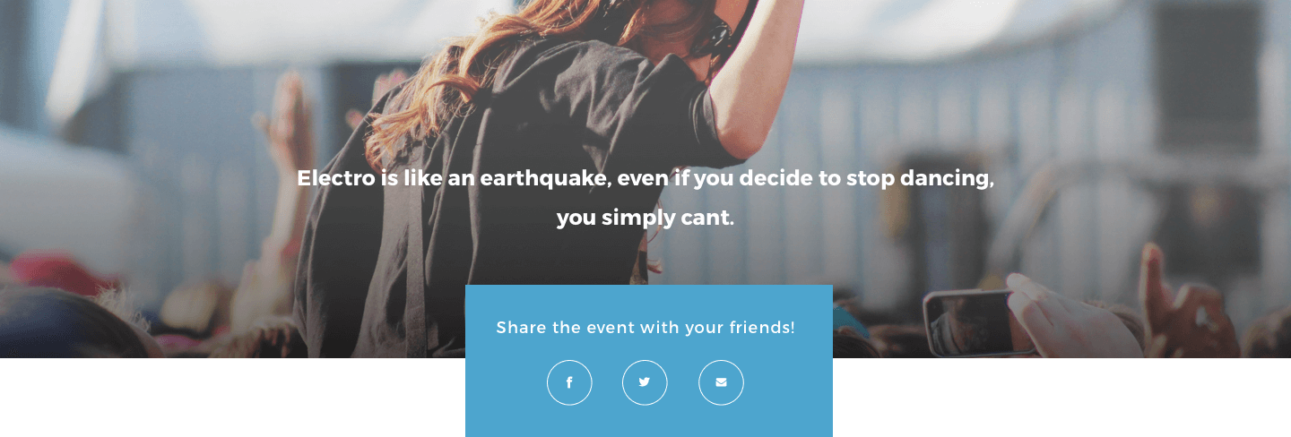
Social share
As crucial part of the ux, I’ve designed a different call to action to invite the users to share the events. Some example:
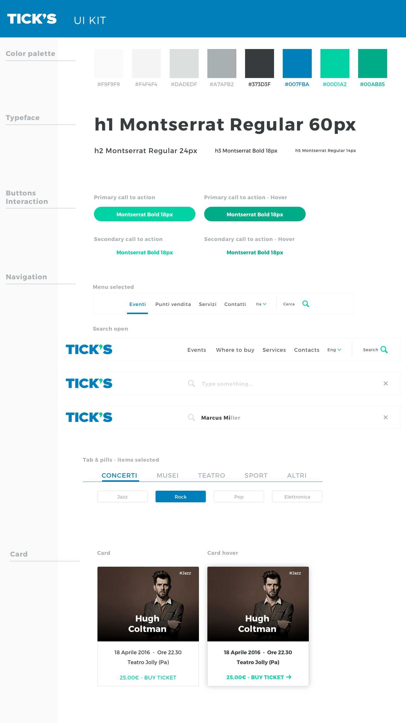
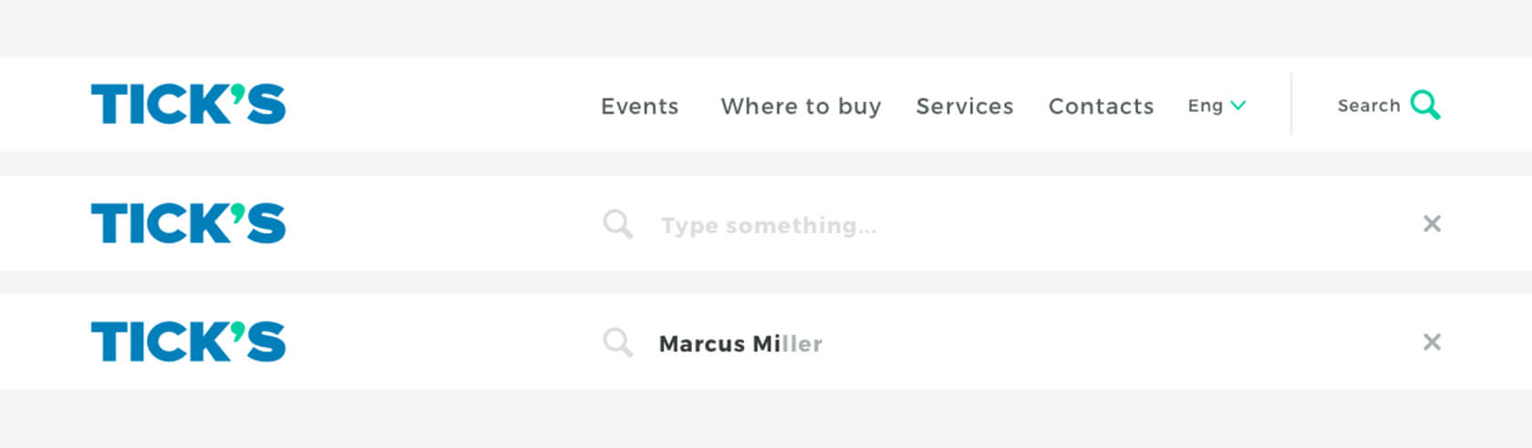
Some UI elements
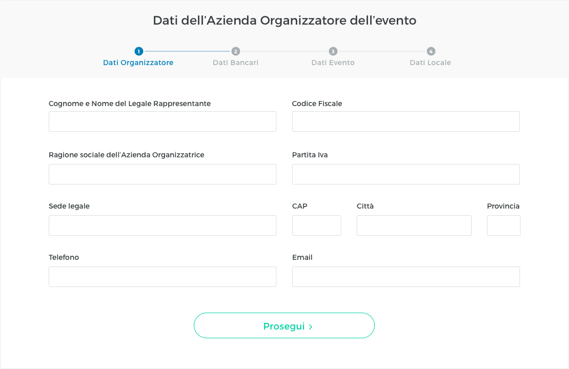
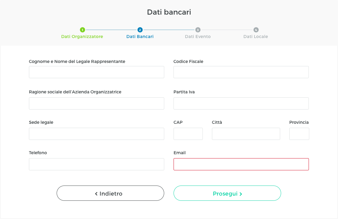
4 steps form with progress trackers for Promoters